- Accessibility Testing
- June 15, 2026
Enhance Your Design: Online Color Contrast Checker Tips
Designing a website that looks beautiful is one thing; designing a website that everyone can actually use is another. In the world of digital design, readability isn’t just a “nice-to-have” feature—it is the foundation of user experience. This is where a color contrast checker online becomes an indispensable tool for designers, developers, and brand managers alike. By ensuring that your text stands out clearly against its background, you aren’t just following a trend; you are opening your digital doors to millions of users with visual impairments, including color blindness and low vision.
The Science of Seeing: Why Contrast Matters
When we talk about digital accessibility, we often focus on complex coding or screen reader compatibility. However, some of the most common web accessibility issues stem from simple design choices. If a user cannot distinguish your call-to-action button from the background, they won’t click it.
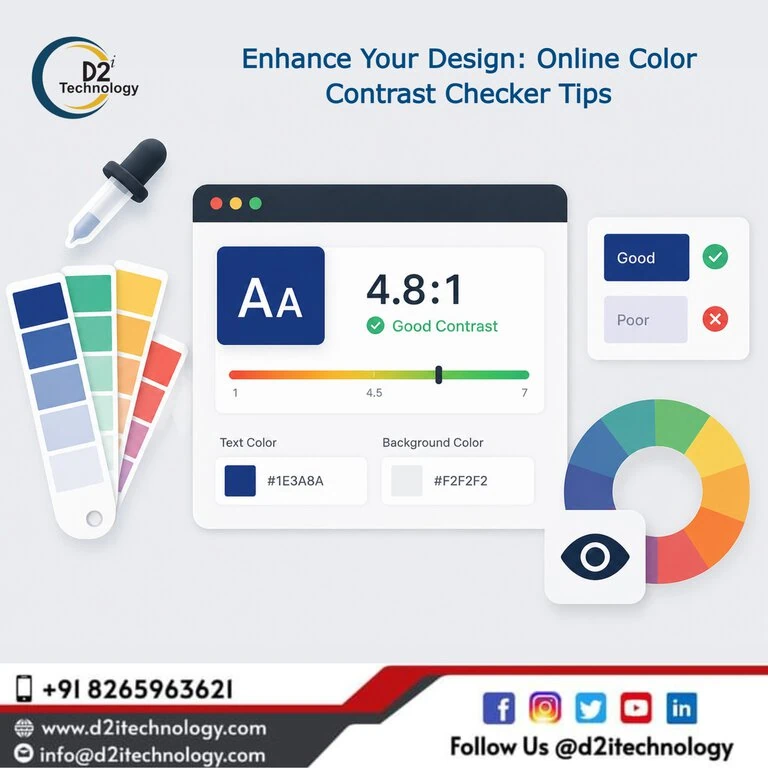
Contrast ratio is a numerical value that represents the difference in light intensity between the foreground (usually text) and the background. A color contrast checker online helps you calculate this ratio instantly, ensuring your palette meets the necessary standards to be legible under various lighting conditions and for diverse vision capabilities.
Understanding WCAG Standards
To provide a universal benchmark, the Web Content Accessibility Guidelines (WCAG) established specific ratios that define “accessible” contrast. When using a WCAG checker online, you will typically aim for two levels of compliance:
- Level AA (Minimum Contrast): Requires a contrast ratio of at least 4.5:1 for normal text and 3:1 for large text (usually 18pt or 14pt bold). This is the standard most accessibility testing services in the USA recommend for general business websites.
- Level AAA (Enhanced Contrast): Requires a ratio of 7:1 for normal text and 4.5:1 for large text. This is the gold standard, often required for government sites or platforms catering specifically to the elderly or visually impaired.
Using a WCAG contrast checker allows you to see exactly where your design falls on this spectrum, helping you make informed adjustments before your site goes live.
Top Tips for Using a Color Contrast Checker Online
Using these tools effectively requires more than just plugging in Hex codes. Here are professional tips to elevate your design process:
1. Check Every State (Hover, Active, Focused)
A common mistake is only checking the default state of a link or button. You must ensure that when a user hovers over a menu item or tabs through a form, the contrast remains compliant. A WCAG checker online should be used to validate the “focus” state, which is critical for keyboard navigation accessibility.
2. Don’t Rely on Color Alone
While a color contrast checker online will tell you if your colors are distinct, remember that some users cannot see color at all. Ensure that important information (like error messages) is conveyed through text labels or icons, not just a red border. This is a core part of the four accessibility principles: Perceivable, Operable, Understandable, and Robust.
3. Test Text Over Images
Gradients and background images are notorious for breaking contrast. If you have white text over a busy photo, use a WCAG contrast checker on the lightest part of the image behind the text. Often, adding a subtle dark overlay or a text shadow can bridge the gap between aesthetic appeal and WCAG compliance.
4. Optimize for Mobile Users
Users on mobile devices are often outside in bright sunlight, which naturally reduces perceived contrast. Designing with higher-than-minimum contrast ratios—checked via a color contrast checker online—ensures your mobile development projects remain usable on the go.
5. Document Your Accessible Palette
Once you find a combination that passes the WCAG checker online, document it in your brand style guide. This prevents “accessibility debt” where future designers accidentally introduce non-compliant colors, requiring expensive accessibility remediation later.
Beyond the Tool: Manual vs. Automated Checks
While a color contrast checker online is a fantastic first step, it is part of a larger ecosystem. Automated tools can catch about 30-40% of issues, but what manual, automated, and hybrid accessibility testing actually is involves a more nuanced approach.
For instance, an automated tool might see a 4.5:1 ratio and give it a “pass,” but if the font is extremely thin or highly stylized, it may still be hard to read. Combining tools with a human accessibility audit ensures your product is truly inclusive.
The Business Case for Color Contrast
Is it worth the effort? Absolutely. High contrast isn’t just about avoiding lawsuits; it’s about market reach.
- SEO Benefits: Search engines favor sites with high usability. Clearer designs lead to lower bounce rates, which can have an impact on website accessibility on ranking factors.
- Brand Trust: A readable site looks professional. When users don’t have to squint to read your content, they stay longer and trust your brand more.
- Legal Compliance: With mandates like the ADA in the US and the recent SEBI accessibility mandate in India, compliance is no longer optional for financial and public entities.
Implementing a Proactive Strategy
Instead of fixing contrast issues after the website is built, integrate a color contrast checker online into the wireframing stage. By catching these issues early, you save time for your website development team and ensure a smoother launch.
At d2i Technology, we believe that digital inclusion transformation is the key to modern business success. Whether you are using Webflow, WordPress, or custom builds, accessibility should be the “north star” of your design process.
Frequently Asked Questions
Partner with d2i Technology for Accessibility Excellence
Don't let poor contrast drive away your customers. Our team of IAAP-certified specialists can help you navigate WCAG requirements and build a high-performing, inclusive website.