
- Web Accessibility
- August 19, 2026
Free Color Contrast Analyzer Tool for WCAG Color Compliance
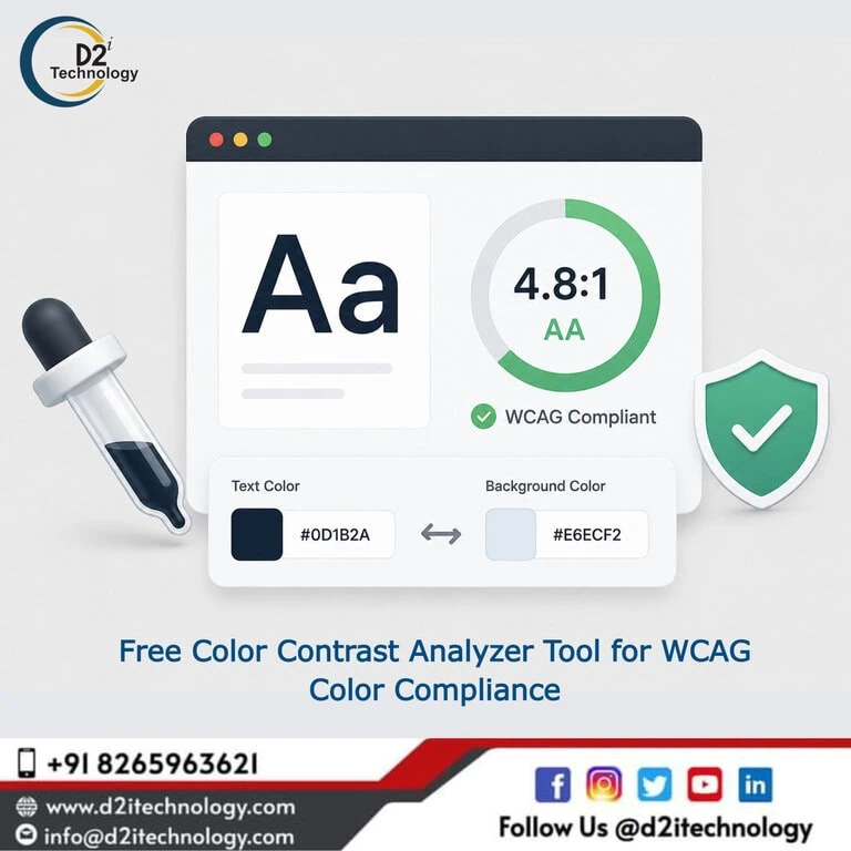
Color on a screen looks very different from how it functions for accessibility. A designer might choose a soft gray text on a pale background because it looks elegant and restrained. A user with low vision, a person viewing that screen in direct sunlight, or someone over 60 experiencing natural changes in contrast sensitivity encounters something quite different: text that’s nearly unreadable. This is why a reliable color contrast analyzer tool isn’t just useful for accessibility compliance — it’s essential for understanding how your design actually performs for the full range of people who’ll encounter it.
This post covers the mechanics of contrast measurement, what the WCAG thresholds mean and why they’re set where they are, the specific contexts where contrast compliance is most commonly missed, and how D2i Technology’s free analyzer tool fits into a practical design and development workflow.
How Contrast Ratio Is Actually Calculated
Understanding the math behind contrast ratios makes it easier to use any analyzer tool intelligently and to understand why certain design decisions pass or fail .
Relative Luminance
WCAG contrast ratio is calculated using relative luminance — a measure of how much light a color reflects or emits, adjusted for the non-linear way human vision perceives brightness. The human eye is more sensitive to changes in brightness at lower luminance values than at higher ones, which is why a contrast ratio is not simply a subtraction of brightness values.
The W3C’s relative luminance formula converts each RGB channel through a linearization function and then combines them using perceptual weights (red contributes approximately 21% to perceived luminance, green contributes approximately 72%, and blue contributes approximately 7%). The contrast ratio is then calculated as (L1 + 0.05) / (L2 + 0.05), where L1 is the higher relative luminance and L2 is the lower.
What this means practically: entering the same two colors into a contrast analyzer will always produce the same result regardless of which is “foreground” and which is “background” — because the formula always places the lighter color in the numerator.
Why the Formula Matters for Designers
Most designers don’t need to calculate this manually — that’s exactly what a color contrast analyzer tool is for. But understanding the underlying model clarifies a few things:
- Why two colors that look very different (say, a dark blue and a dark red) can still have a low contrast ratio — perceived hue difference doesn’t predict luminance difference.
- Why adding transparency to a color changes its effective contrast ratio (transparent colors blend with whatever’s behind them, creating a new effective color).
- Why the same text color can pass against one background and fail against another that appears visually similar.
The WCAG Web Accessibility Initiative and how its standards were developed provides useful context on why these technical standards are structured the way they are — including why the contrast thresholds were set at specific ratios rather than arbitrary round numbers.
The WCAG Contrast Thresholds — and What Each One Covers
WCAG 2.1 Level AA: The Baseline
4.5:1 — Required for normal text (under 18pt at regular weight, under 14pt at bold). This applies to body copy, navigation labels, captions, button text, form field text, and any text that users need to read to complete a task.
3:1 — Required for large text (18pt or above at regular weight, 14pt or above at bold). The lower threshold for large text reflects that size itself improves legibility — larger characters tolerate lower contrast better than small ones.
3:1 — Required for non-text content: UI component boundaries (form field borders, checkbox outlines, radio button edges), graphical elements used to convey information (icons, chart elements, data visualization marks), and active user interface components in their interactive states.
WCAG 2.1 Level AAA: The Higher Bar
7:1 — Required for normal text at AAA level. This represents approximately double the contrast of the AA requirement and is the level expected for contexts where the highest degree of accessibility is needed — specialized medical interfaces, government service portals for elderly populations, applications designed for users with significant visual impairments.
4.5:1 — Required for large text at AAA level.
What WCAG 2.2 Adds
WCAG 2.2 didn’t change the core contrast thresholds from WCAG 2.1. However, it introduced Success Criterion 2.4.11 (Focus Appearance), which requires that keyboard focus indicators meet a minimum contrast ratio between the focused and unfocused states — ensuring that focus indicators are actually visible, not just present. This is a significant addition that many design systems fail on: focus rings that exist in the CSS but are too low-contrast to be seen.
How accessibility standards are evolving in 2026 and what WCAG 3 will change covers the most significant upcoming change to contrast measurement: the Advanced Perceptual Contrast Algorithm (APCA), which WCAG 3 is expected to adopt. APCA accounts for font weight, size, and viewing context in ways the current ratio-based approach doesn’t — which will change how some color combinations are evaluated, making some currently-failing combinations acceptable and some currently-passing ones problematic.
Where Contrast Compliance Is Most Commonly Missed
Text Over Images and Gradients
The WCAG contrast requirements apply between the text foreground and the effective background — which becomes complicated when text sits over a photograph, an illustration, or a gradient that changes color underneath the text. A single spot-check against the lightest part of the gradient doesn’t cover the full range.
The practical approaches here are: using a solid color overlay or semi-transparent dark panel behind text, ensuring the darkest or lightest point of any gradient still meets the required ratio against the text, or confining text to a region of the image where the contrast is consistently adequate.
D2i Technology’s free Color Contrast Analyzer handles solid color pairs precisely. For image and gradient cases, it’s used in conjunction with sampling the actual pixel colors from the most challenging background regions.
Placeholder Text in Form Fields
Placeholder text — the hint text that appears inside an input field before a user types — is almost universally too low-contrast on most websites. The light gray that’s typically used to communicate “this is placeholder, not real content” communicates that visually, but it fails WCAG 1.4.3 for many users who simply can’t read it.
The argument that placeholder text is “decorative” doesn’t hold up well: placeholder text typically conveys the expected input format, and failure to read it creates a real task completion barrier. Common web accessibility issues and where to find them includes placeholder contrast as one of the most predictable failures in form design.
Disabled State and Muted Interactive Elements
Disabled buttons, inactive tabs, and unavailable options are commonly designed with intentionally muted, low-contrast appearances to signal their inactive state. WCAG exempts inactive UI components from contrast requirements — but this exemption is misapplied frequently.
The exemption applies to truly inactive controls that a user cannot interact with. It doesn’t apply to elements that appear disabled but are still navigable, elements that become active based on certain conditions, or any text that provides information even if it looks muted. When in doubt, meeting the 3:1 threshold for non-text contrast is the safer approach.
Focus Indicators
This is the area where WCAG 2.2 added requirements that are now widely violated. Focus indicators — the visual ring or highlight that shows which element has keyboard focus — need to have sufficient contrast between their focused and unfocused states under WCAG 2.4.11. Many design systems use a 1px blue outline that simply isn’t visible against certain backgrounds, or use CSS to suppress the default browser focus ring without adding an adequate custom replacement.
What it means to go beyond the basic WCAG color contrast requirements covers focus indicator contrast alongside the other non-text contrast requirements that WCAG 1.4.11 and 2.4.11 introduce.
Dark Mode
Dark mode has become a design standard, but many teams check contrast in their default (light) color scheme and forget to verify their dark mode palette. A color combination that passes in light mode frequently fails in dark mode because the luminance relationships invert — text that was dark on a light background becomes light on a dark background, and the new combination may not meet the required ratio.
A properly implemented contrast check covers both themes. How contrast tools should be integrated into the accessibility workflow for site enhancement addresses exactly this multi-context checking practice.
Color Blindness Simulation: The Underused Analyzer Feature
Contrast ratio is a metric derived from a standard observer model — it doesn’t account for specific types of color vision deficiency. A combination that passes the 4.5:1 threshold based on luminance calculation can still present significant challenges for users with certain types of color blindness.
Protanopia (red-blind) and deuteranopia (green-blind) affect approximately 8% of men and 0.5% of women globally. Users with these conditions perceive colors differently — particularly reds and greens — in ways that can reduce the effective contrast even when the luminance-based ratio meets the WCAG threshold.
Color blindness simulation tools render a color combination as it would appear to users with different types of color vision deficiency, providing a qualitative check that complements the quantitative ratio. This isn’t a WCAG requirement — WCAG doesn’t mandate passing color blindness simulations — but it’s a design quality check that catches combinations that technically pass the math but practically fail certain users.
How major technology companies and social media platforms approach accessibility inclusively shows how leading products build color blindness considerations into their design systems — not as a compliance exercise but as a product quality standard.
Color Contrast in Global Accessibility Regulations
Color contrast requirements under WCAG 2.1 Level AA apply across most major accessibility regulations globally, making the analyzer tool relevant beyond the US context:
United States: ADA Title II requirements and Section 508 both reference WCAG 2.1 Level AA, making contrast compliance legally required for government entities and federal contractors. The ADA Title II digital accessibility requirements for US and Indian websites in 2026 covers the specific compliance landscape.
Australia: The Australian Government’s accessibility framework requires WCAG 2.1 Level AA for government digital services. Australia’s web accessibility updates for 2026 outlines the current requirements and enforcement environment.
India: SEBI-regulated entities and public sector organizations in India are increasingly required to meet WCAG 2.1 Level AA, making contrast compliance relevant across the Indian digital landscape as well.
The consistent presence of WCAG contrast criteria across international accessibility regulations means that checking contrast isn’t just a US compliance requirement — it’s a global digital quality standard.
Integrating the Analyzer Into Design and Development Workflows
The most effective use of a color contrast analyzer isn’t checking colors after designs are finalized — it’s running checks as color decisions are made.
During design token creation: When defining the color tokens for a design system — primary, secondary, semantic colors for success/warning/error states, text colors, background colors — every pairing that will be used for text should be checked against its intended background immediately. This is the moment when a failing combination costs least to fix.
During design handoff: Any design specification that includes text on a colored background should include the confirmed contrast ratio alongside the color values. This removes ambiguity for developers and prevents “but it looks fine to me” conversations later.
During development: When implementing CSS, verify that the colors as coded match what was specified and that the contrast check results hold. CSS transformations, opacity, blend modes, and inherited color values can all change effective contrast in ways that aren’t visible in design tools.
During QA: Include a contrast check pass in the definition of done for any UI component that includes text or interactive elements.
Tips for using an online color contrast checker to maximum effect covers practical workflow integration in more detail — particularly useful for design teams transitioning to accessibility-conscious workflows for the first time.
When the Analyzer Connects to Broader Accessibility Work
Passing every color contrast check is one requirement across WCAG’s 50 Level AA success criteria. A website with perfect contrast but missing image alt text, broken keyboard navigation, and unlabeled form fields is still deeply inaccessible.
Color contrast checking is the fastest, most concrete entry point to accessibility — it’s measurable, fixable, and immediately visible in tool results. But the broader accessibility picture requires a more comprehensive approach. D2i Technology’s full accessibility testing services extend from contrast checking through full manual WCAG evaluation, and accessibility remediation services address findings in both code and content.
For organizations trying to understand the full scope of what accessibility compliance involves in their sector, why businesses need comprehensive accessibility testing services in 2026 provides the fuller context that contrast checking alone can’t communicate.
Conclusion
A color contrast analyzer tool is one of the most immediately useful tools in the accessibility checking ecosystem — precise, fast, and actionable. The math behind it reflects decades of research into human color perception, and the WCAG thresholds it checks against are embedded in accessibility regulations across most of the world’s major markets.
Used well — at the right points in the design and development process, for the right combinations including non-text UI elements, dark mode palettes, and focus indicators — a contrast analyzer prevents one of the most common and most user-impactful categories of accessibility failure before it reaches production.
D2i Technology’s free Color Contrast Analyzer is built for exactly this kind of practical, workflow-integrated use. Start checking your combinations at d2itechnology.com/tools/color-contrast-analyzer/ — and reach out when your accessibility program needs to go further than contrast alone.
Frequently Asked Questions
Start With Contrast — Then Build a Complete Accessibility Program
D2i Technology's free Color Contrast Analyzer gives you instant WCAG compliance checking for any color combination. When your organization needs the full picture — comprehensive accessibility audits, remediation, and compliance documentation — our certified team is ready to help.