
- Web Designing
- October 16, 2026
How a Church Website Helps You Welcome New Visitors Before Sunday
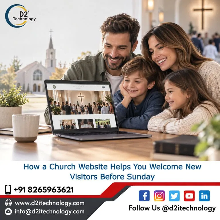
A church website is often the first place a visitor meets your community, and it happens days before anyone walks through the door. Someone new to town searches for a church nearby, opens a few results, and decides within a minute or two whether yours feels like a place they could belong. If the site is slow, out of date or awkward on a phone, most people simply move on. They never tell you why.
A well-built church website changes that outcome. It answers questions early, settles first-time nerves and makes Sunday feel like an easy decision. At D2i Technology, we design, develop and test websites for many kinds of organizations, and the pattern is consistent. The sites that work best are not the flashiest. They make the next step obvious.
This guide covers what visitors actually look for, which features are worth building, and how to keep your site accessible and easy to maintain.
Why Visitors Check Your Church Website Before They Visit
Walking into a church for the first time can feel like arriving at a party where you do not know anyone. People wonder what to wear, where to park, whether the kids will be looked after and how long the service runs. Many feel awkward asking, so they look online first.
Picture someone like Sam, who has just moved across town with two young children. On Saturday night, Sam searches for a church nearby and opens three sites. The first hides its service times inside a PDF. The second has not been updated since 2021. The third shows Sunday times on the homepage, a short video of the entrance, a note about children’s check-in and a “Plan a Visit” button. Sam picks the third without a second thought.
Nothing about that third site was complicated. It simply answered the questions Sam already had.
What First-Time Visitors Want From a Church Website
Before thinking about design, think about information. Most first-time visitors are looking for the same handful of things, and they want them quickly.
Service Times and Location on the Homepage
Put your service times, address and a map link where people see them without scrolling. Write them as real text, not as part of an image, so search engines and screen readers can read them. Add parking details if they are not obvious, and keep your Google Business Profile consistent with what the site says. When the two disagree, people lose trust fast.
A Clear “What to Expect” Page
This is often the most useful page on a church website. Explain how long the service lasts, what people wear, what the music is like, whether there is a sermon series and what happens with offerings. Write it the way you would explain it to a friend. A few real photos of the building and the greeting team help more than any stock image.
Information for Kids and Families
Parents want to know where to take their children, how check-in works and who looks after them. Give each age group its own short description, mention safety procedures, and say plainly what a parent should do on arrival. This single page can decide whether a young family visits at all.
The People Behind the Church
A short staff or leadership page with real photos and a line or two about each person makes the church feel approachable. New visitors like to recognize a face before they arrive.
Church Website Design Features That Help You Welcome New Visitors
Good church website design is less about decoration and more about removing friction. A few features do most of the work.
A Simple “Plan a Visit” Form
Let people tell you they are coming. Ask for a name, an email address, how many are attending and whether they have children. Then follow up with a short, friendly message with directions and parking tips. The goal is to turn “maybe” into “see you Sunday.” Keep the form short. Every extra field costs you a few responses.
A Mobile-First Layout
Most people will find your church from a phone, often while standing in a driveway or sitting in a parked car. Buttons need to be large enough to tap, text needs to be readable without zooming, and the menu should be easy to use with one hand. If you are unsure how your site looks on small screens, open it on your own phone and try to find the service time in under ten seconds.
Fast Loading Pages
Large uncompressed photos are the most common reason church sites feel slow. Compress images, avoid auto-playing background videos, and test your pages against Google’s Core Web Vitals. A page that loads in a couple of seconds feels welcoming. One that takes ten feels broken. For deeper issues, our performance testing services can pinpoint what is slowing things down.
Events, Sermons and Livestreams
Keep upcoming events in a single, easy-to-scan calendar. Post recent sermons as audio or video with a short summary, so a visitor can get a feel for the teaching before attending. If you livestream, link to it from the homepage and add captions where you can. Captions help people who are deaf or hard of hearing, and also anyone watching without sound.
Secure Online Giving
If you accept donations online, treat payment security seriously. Use a trusted payment provider, do not store card details on your own server, and have the giving flow reviewed regularly. A custom setup built by an experienced web development company can connect giving, event registration and member communication, but a well-configured third-party tool is often enough for smaller congregations.
Make Your Church Website Accessible to Everyone
A church should be open to everyone, and its website should be too. Your congregation likely includes older adults, people with low vision, people who are deaf or hard of hearing, and people who navigate with a keyboard or switch device instead of a mouse. If the site does not work for them, they cannot get to the information that tells them they are welcome.
The standard to follow is the Web Content Accessibility Guidelines (WCAG). In practice, that means a few habits:
- Use enough color contrast between text and background. You can check yours with our free color contrast analyzer.
- Add descriptive alt text to meaningful images, such as a photo of the entrance.
- Make sure every form field has a visible label.
- Ensure the whole site can be used with a keyboard alone.
- Caption videos and provide transcripts for sermons where possible.
Accessibility also helps with search visibility, because clear structure and readable content benefit everyone. If budget is tight, our post on making a website accessible on a budget is a good place to start. When you want expert eyes on the site, D2i Technology provides accessibility services for organizations of every size.
Keep Your Church Website Updated Without a Developer
Many church websites fail not because they were built badly, but because nobody owns them after launch. The volunteer who built the site moves away, the password gets lost, and the homepage still advertises last Easter.
A few simple habits prevent that:
- Name one person responsible for the site, and one backup.
- Choose a content management system that non-technical people can use confidently.
- Store logins in a shared password manager, not in someone’s email.
- Review every page once a month for outdated times, names and links.
If you are weighing a template against something built for your needs, our comparison of a custom website and WordPress can help you decide.
Common Church Website Mistakes to Avoid
Most problems we see are small and easy to fix once you know to look for them.
- Burying service times. If it takes more than one tap to find them, move them up.
- Using insider language. Terms like “connect group” or “narthex” may mean nothing to a newcomer. Explain them or use plainer words.
- Relying on PDFs. They are slow on phones and hard for screen readers. Use regular web pages instead.
- Leaving old events up. A calendar full of past dates makes the whole site feel abandoned.
- Too many menu items. Five or six clear options beat fifteen vague ones.
- Ignoring the follow-up. A form that goes nowhere is worse than no form at all.
Where to Start With Your Church Website
You do not need a complete rebuild to see improvement. Begin with a short audit. Open your site on a phone and ask a friend who has never attended to find the service time, the address and the children’s program. Watch where they hesitate. Whatever slows them down is where to start.
If the site needs more than a few fixes, a new build may be the better investment. D2i Technology works with teams in the USA and India to design, develop and test websites that load quickly, read clearly and work for every visitor. Whether you need a straightforward informational site or a custom platform with giving and event registration, our custom web development team can scope it with you.
Sunday starts long before the first song. For many visitors, it starts on your website.
Frequently Asked Questions
Ready to Build a Church Website That Welcomes Everyone?
D2i Technology designs and develops fast, accessible websites that help your congregation connect with new visitors long before Sunday. Tell us what you need and we will suggest a practical plan.