
- Web Development
- July 27, 2026
Best Web Accessibility Color Contrast Tool in USA for WCAG Compliance
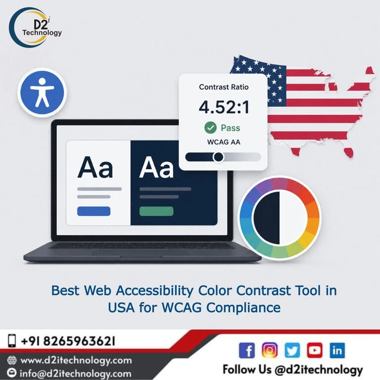
Color contrast is one of those accessibility requirements that looks straightforward until you start checking your own website against it — and then you realize how many combinations quietly fail. For US-based organizations working toward WCAG compliance, having a reliable web accessibility color contrast tool isn’t a nice-to-have. It’s a practical necessity for any design or development workflow that takes accessibility seriously.
This post covers why color contrast matters for accessibility and compliance, how WCAG contrast requirements actually work, what to look for in a checking tool, and how professional accessibility services fit into the picture when tooling alone isn’t enough.
Why Color Contrast Matters More Than Most Designers Realize
Contrast between text and its background determines whether content is actually readable — or whether it’s technically present but practically invisible to a significant portion of your users. This isn’t a minor edge case. An estimated 300 million people worldwide have some form of color vision deficiency, and low contrast affects far more people than that: older users with age-related vision changes, people viewing screens in bright sunlight, users on low-quality displays, and anyone dealing with temporary conditions like eye strain.
When contrast is insufficient, people can’t read your content. That’s not an accessibility problem in the abstract — it’s a content failure that affects your core audience and undermines everything else you’ve built on the page.
Beyond the user impact, contrast failures are also among the most consistently cited issues in WCAG accessibility audits. They appear regularly in accessibility lawsuits against US organizations, and they’re a central component of ADA Title II compliance requirements that now apply to state and local government websites. If you’re auditing a site for accessibility, contrast is never optional.
Understanding WCAG Color Contrast Requirements
The Contrast Ratio Explained
WCAG measures contrast using a ratio calculated from the relative luminance of two colors — the foreground (text or icon) and the background it sits against. The ratio runs from 1:1 (no contrast at all, identical colors) to 21:1 (maximum contrast, black on white).
WCAG 2.1 Level AA — the standard required by most US accessibility regulations — sets the following thresholds:
- Normal text (under 18pt regular or under 14pt bold): minimum contrast ratio of 4.5:1
- Large text (18pt or larger regular, or 14pt or larger bold): minimum contrast ratio of 3:1
- UI components and graphical objects (icons, form borders, chart elements): minimum ratio of 3:1
WCAG 2.1 Level AAA raises the bar for normal text to 7:1 and large text to 4.5:1 — standards that apply in contexts where the highest level of accessibility is expected.
There is one important nuance worth knowing: decorative images, logos, and text embedded within images are exempt from contrast requirements. But that exemption is narrower than it sounds, and relying on it too broadly is a common mistake. Understanding color contrast requirements beyond the basic WCAG thresholds helps clarify where the exemptions genuinely apply and where they don’t.
What Changes With WCAG 2.2 and Beyond
WCAG 2.2 — the current published standard — retained the same contrast criteria from WCAG 2.1 for the core success criteria. However, it added new requirements around non-text contrast for focus indicators (Success Criterion 2.4.11), which affects how interactive elements like buttons and form fields are visually distinguished in their focused state.
The accessibility testing landscape for WCAG 3 and ADA compliance in 2026 is evolving, with the next generation of WCAG expected to introduce a revised contrast measurement model (APCA — Advanced Perceptual Contrast Algorithm) that better accounts for how human vision perceives contrast at different sizes and weights. For now, the 4.5:1 ratio is the baseline, but organizations doing forward-looking accessibility work should be aware of where standards are heading.
What Makes a Good Web Accessibility Color Contrast Tool
Accurate Ratio Calculation
This is the fundamental requirement. A contrast checker needs to correctly implement the WCAG relative luminance formula — which accounts for the non-linear way human vision processes brightness — and return the correct ratio for any two colors entered. Tools that cut corners here produce misleading results that create false confidence.
Support for Multiple Input Formats
Design teams work in hex codes, RGB values, HSL, and sometimes named colors. A tool that only accepts one format creates friction. The best contrast checkers accept any format a designer or developer might naturally use, converting internally before running the calculation.
Real-Time Feedback Against WCAG Thresholds
The most useful tools don’t just return a ratio — they tell you immediately whether the combination passes or fails at each relevant WCAG level, for both normal and large text. This instant feedback is what makes a tool practical during design iteration rather than useful only after the fact.
D2i Technology’s free online color contrast analyzer provides exactly this: accurate ratio calculation, multi-format input support, and clear pass/fail feedback against WCAG 2.1 Level AA and AAA standards. It’s built for use during design and development, not just for compliance checking after the fact.
Visual Preview
Seeing a color combination rendered — not just as a ratio number — helps designers understand what users actually experience. A tool that shows text on background in real time, at different simulated sizes, gives you the qualitative context to make better decisions alongside the quantitative pass/fail result.
Color Blindness Simulation
Because contrast failures often affect people with color vision deficiencies differently from the general population, tools that simulate different types of color blindness (protanopia, deuteranopia, tritanopia, achromatopsia) help designers catch combinations that pass the ratio threshold but still present problems for specific user groups.
For practical guidance on using these tools effectively in a real workflow, tips for using an online color contrast checker covers the common missteps and how to avoid them.
Common Color Contrast Mistakes on US Websites
Relying Solely on Brand Colors Without Checking
Brand colors are chosen for many reasons — emotional resonance, distinctiveness, market positioning. Accessibility ratios aren’t usually among them. This creates a recurring problem where brand-mandated color combinations fail WCAG thresholds, and teams discover this late in the design process when it’s expensive to address.
The solution is to run contrast checks during the early color palette stage, not just before launch. If brand colors don’t pass, there’s usually room to adjust the shade without significantly changing the visual identity — but that adjustment is much easier before designs are finalized.
Overlooking Placeholder Text and Disabled States
Placeholder text in form fields — the light gray hint text that disappears when you type — almost universally fails WCAG contrast requirements. The same applies to disabled button states where text is intentionally muted. These states have specific WCAG exemptions in some cases, but teams often either apply the exemption too broadly or ignore the requirement entirely. A thorough contrast review catches both.
Ignoring Contrast on Interactive Elements
WCAG 1.4.11 (Non-Text Contrast, Level AA) requires that UI component boundaries — form field borders, checkbox outlines, radio button edges, focus indicators — meet a 3:1 contrast ratio against adjacent colors. This requirement is widely overlooked, particularly for form elements styled with thin gray borders against white backgrounds, which frequently fail. The common accessibility issues found in websites include this pattern consistently.
Missing States That Change Color
Buttons change color on hover, on focus, when pressed. Links change color when visited. Each of these states needs to be checked independently — a link that passes in its default state may fail in its visited state if that color wasn’t specifically validated.
When a Tool Isn’t Enough: The Role of Professional Accessibility Testing
Contrast checkers are essential, but they test one thing. WCAG has 78 success criteria at Level AA, and color contrast accounts for two of them. A site that passes every contrast check you run can still have significant accessibility failures in keyboard navigation, screen reader compatibility, form labeling, focus management, and dozens of other areas.
For organizations with compliance obligations — particularly under ADA Title II requirements for government and public sector websites — a manual accessibility audit conducted by certified professionals is necessary to establish a credible compliance posture. Automated tools, including contrast checkers, catch approximately 30–40% of WCAG failures. The rest require human judgment.
D2i Technology provides comprehensive accessibility testing services that cover the full WCAG 2.1 and 2.2 criteria, including color contrast as one component of a complete audit. When issues are found, accessibility remediation services translate the findings into actionable fixes that actually close the compliance gap rather than just documenting it.
For organizations that want to understand where they stand before engaging a full audit, the D2i AccessScan tool provides automated accessibility scanning that covers a broader range of WCAG criteria alongside contrast checking. It’s a useful first pass that identifies the most pressing issues and helps prioritize remediation effort.
Integrating Color Contrast Into the Design and Development Workflow
The most efficient way to handle color contrast compliance isn’t to check it at the end of a project. It’s to make it part of how design decisions get made throughout the process.
During design, this means checking every color combination as it’s chosen — not just primary brand colors, but secondary palette variations, text-on-image combinations, overlay colors, and state variations for interactive elements. Tools like D2i Technology’s color contrast analyzer are built for this kind of real-time use during design.
During development, this means catching any new color combinations introduced in code that weren’t in the original designs, and verifying that CSS inheritance hasn’t created contrast failures that weren’t visible in static mockups.
Understanding how to enhance your site with color contrast tools for accessibility provides a practical framework for embedding these checks into existing workflows without adding excessive friction.
For teams working toward accessibility compliance on a constrained budget, starting with contrast — because it’s measurable, fixable, and directly impactful — is often the highest-leverage place to begin.
Conclusion
Color contrast is a measurable, fixable, and genuinely important piece of web accessibility. A reliable web accessibility color contrast tool gives design and development teams the means to check their work against WCAG standards in real time, catch failures before they reach production, and make informed decisions about color choices throughout the design process.
But contrast is one part of a larger accessibility picture. For US organizations operating under ADA or Section 508 requirements, a complete compliance posture requires the kind of thorough manual audit that tools alone can’t provide. D2i Technology offers both the tooling and the professional services to address color contrast and the full range of WCAG requirements — so your accessibility effort adds up to genuine compliance, not just a checklist of tested items.
Frequently Asked Questions
Need More Than a Color Contrast Check?
D2i Technology provides full-spectrum WCAG accessibility audits, contrast analysis, and remediation services for US businesses and government organizations. Whether you need a quick accessibility scan or a comprehensive compliance engagement, our certified team is ready to help.