- Web Accessibility
- June 22, 2026
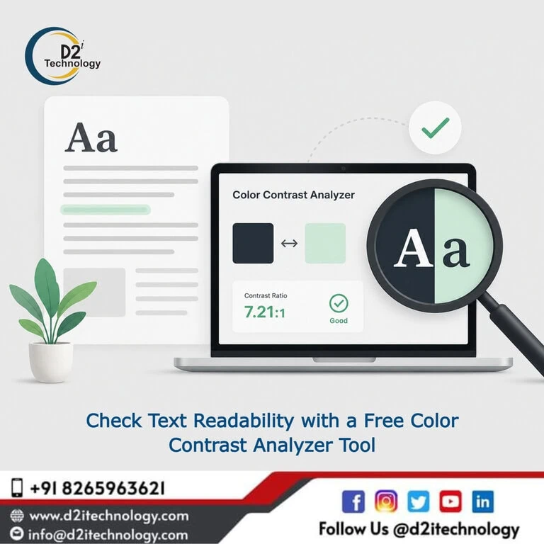
Check Text Readability with a Free Color Contrast Analyzer Tool
Color contrast is one of those accessibility requirements that looks simple on the surface but fails on more websites than you would expect. If your text blends into its background even slightly, users with low vision, color blindness, or those reading on a bright screen struggle to make sense of your content. Running your design through a free color contrast analyzer tool before publishing can prevent this entirely — and it takes less than a minute.
Whether you are a developer building a new product, a designer finalizing a UI, or an accessibility consultant preparing a compliance audit, a color contrast checker online should be a standard part of your workflow. This post walks you through what these tools do, what WCAG says about contrast, why it matters beyond compliance, and how D2i Technology approaches contrast as part of a full accessibility strategy.
What Is Color Contrast and Why Does It Matter?
Color contrast refers to the difference in luminance between a foreground element — typically text — and its background. When that difference is too small, the content becomes visually indistinct. This does not only affect users with visual impairments. It affects everyone reading in poor lighting conditions, on low-quality displays, or under cognitive fatigue.
For users with conditions like cataracts, glaucoma, diabetic retinopathy, or various forms of color blindness, inadequate contrast is not an inconvenience — it makes content completely inaccessible.
From a business standpoint, poor contrast also hurts engagement. Content that strains the eye leads to higher bounce rates, shorter session durations, and lower trust in your brand. Getting contrast right is both an ethical responsibility and a practical performance decision.
What WCAG Says About Color Contrast
The Web Content Accessibility Guidelines (WCAG) define minimum contrast ratios that websites must meet depending on the text size and the conformance level being targeted.
WCAG 2.1 and 2.2 Contrast Requirements
Under WCAG Success Criterion 1.4.3, the contrast requirements are:
- Normal text (below 18pt or 14pt bold): minimum ratio of 4.5:1 at Level AA
- Large text (18pt or 14pt bold and above): minimum ratio of 3:1 at Level AA
- Enhanced (Level AAA): 7:1 for normal text, 4.5:1 for large text
WCAG 2.2 also introduced Success Criterion 1.4.11 (Non-text Contrast), which requires UI components and graphical elements like form borders, icons, and focus indicators to meet a minimum 3:1 contrast ratio against adjacent colors.
If your project involves ADA Title II compliance — which now mandates WCAG 2.1 Level AA conformance for state and local government websites in the USA — contrast failures can result in legal exposure. You can read more about these requirements in our detailed post on ADA Title II digital accessibility compliance.
How a Free Color Contrast Analyzer Tool Works
A color contrast analyzer tool calculates the relative luminance of two colors and returns a contrast ratio. Most tools allow you to input hex codes, RGB values, or pick colors directly from a color picker. The result tells you immediately whether the combination passes or fails WCAG AA or AAA thresholds.
D2i Technology offers its own free color contrast analyzer tool at d2itechnology.com/tools/color-contrast-analyzer/. It is a clean, no-login, browser-based tool that checks your foreground and background color pairs against WCAG 2.1 and 2.2 standards in real time.
Key Features to Look for in a WCAG Contrast Checker
A reliable WCAG contrast checker should give you:
- Instant pass/fail feedback for Level AA and AAA for both normal and large text
- Non-text contrast checking for UI components per WCAG 1.4.11
- Hex, RGB, and HSL input support so you can work directly with your design tokens
- Suggested alternatives when a color combination fails, helping you adjust without redesigning from scratch
- Clear visual preview of the foreground/background combination so you can see it, not just read numbers
Using a tool like this early in the design phase is far more efficient than catching contrast failures during a full accessibility audit. It also makes it easier to communicate findings to designers and developers who may not be familiar with WCAG ratios.
Who Should Use a Color Contrast Checker Online?
The short answer: anyone who puts text on a screen.
Web Designers and UI/UX Teams
Designers often choose color palettes based on brand identity, aesthetics, and emotional tone. Contrast ratios are not always front of mind. A web accessibility color contrast tool used during the design stage — whether in Figma, Adobe XD, or directly in the browser — means accessibility is built in rather than bolted on after development.
Front-End Developers
Developers translating design comps into code sometimes make subtle changes to colors — adjusting opacity, using CSS variables, or applying box shadows — that can inadvertently drop contrast below WCAG minimums. Running a quick check during development or code review catches this before QA.
Accessibility Auditors and Consultants
For professionals running formal web accessibility testing, contrast ratio checking is one of the most consistent and automatable parts of a WCAG audit. Using a dedicated color contrast analyzer tool alongside broader audit toolkits makes the process faster and the results more defensible.
If you are evaluating accessibility tools for audit work, our overview of the best accessibility testing toolkit covers how to combine contrast checkers with other automated and manual testing methods.
Content Editors and Marketers
Blog authors, email designers, and social media teams regularly apply custom text colors, button styles, and backgrounds. Many content management systems do not warn you when a chosen color combination falls below WCAG thresholds. A free color contrast analyzer tool helps non-technical team members self-audit before publishing.
Color Contrast Beyond Compliance: Real Accessibility Impact
Passing a WCAG contrast ratio does not automatically mean your design is readable for every user. There are scenarios where a 4.5:1 ratio is technically sufficient but visually problematic.
For example, certain red-green combinations may pass numerically but remain difficult for users with deuteranopia. Thin or decorative fonts can appear lower in contrast than their hex values suggest. Anti-aliasing on some operating systems can reduce perceived sharpness, particularly at smaller font sizes.
This is why contrast checking should be part of a broader approach that includes manual review, user testing with assistive technologies, and professional web accessibility remediation when issues are identified.
You can also read our dedicated post on color contrast beyond WCAG for a deeper look at edge cases and perception factors that numbers alone do not capture.
Free Color Contrast Analyzer Tool in India and USA
The need for compliant, readable digital experiences is growing across markets. In India, SEBI has mandated WCAG compliance for financial institutions, and government digital portals are increasingly held to accessibility standards. In the USA, ADA Title II and Section 508 set enforceable contrast requirements for government and federally funded organizations.
D2i Technology works with clients across both geographies — from Noida and Mumbai to Charlottesville and New York — helping teams identify and fix contrast failures as part of complete accessibility remediation services. Our free online tools, including the color contrast analyzer, are designed to be useful regardless of where your team is based.
For teams in India looking for guidance on regulatory requirements, our post on accessibility compliance for SEBI-regulated entities covers what WCAG conformance means in the Indian financial sector context.
For US-based teams, our breakdown of top accessibility testing services in the USA explains how professional audit and remediation services complement DIY tooling.
Integrating Contrast Checking Into Your Workflow
A one-time check is better than nothing, but contrast issues creep back in as designs evolve, content updates roll out, and CSS changes accumulate. The most effective approach is to make contrast checking a repeatable, integrated habit.
Here is how D2i Technology recommends approaching this:
- Design Phase — Use the contrast analyzer alongside your design tool to validate every new color combination before handoff.
- Development Phase — Include contrast validation in your code review checklist, particularly when CSS color values change.
- Pre-Launch Audit — Run a structured accessibility audit that includes contrast as part of the WCAG 1.4 criteria review, covering both text and non-text elements.
- Ongoing Monitoring — Schedule periodic audits after major content updates or redesigns. Contrast can fail silently when themes or templates change.
For teams managing multiple pages or components, combining the free tool with a manual accessibility audit gives you both speed and depth.
How D2i Technology Can Help
D2i Technology provides end-to-end accessibility testing and remediation services for organizations that need more than a browser-based tool. Our IAAP-certified specialists conduct comprehensive WCAG 2.1 and 2.2 audits, identify contrast failures across entire design systems, and work directly with your development team to implement compliant fixes.
We also build accessibility-first web solutions from the ground up — meaning contrast, keyboard navigation, ARIA semantics, and screen reader compatibility are part of the design process, not an afterthought.
If your organization is facing an accessibility compliance deadline or simply wants to ensure your digital products are usable by everyone, our team is ready to help.
Frequently Asked Questions
Make Your Website Readable for Everyone
Whether you need a quick contrast check or a full WCAG accessibility audit, D2i Technology's certified specialists are here to guide you. From free tools to hands-on remediation, we help you build digital experiences that everyone can use.