- Website Accessibility
- November 27, 2025
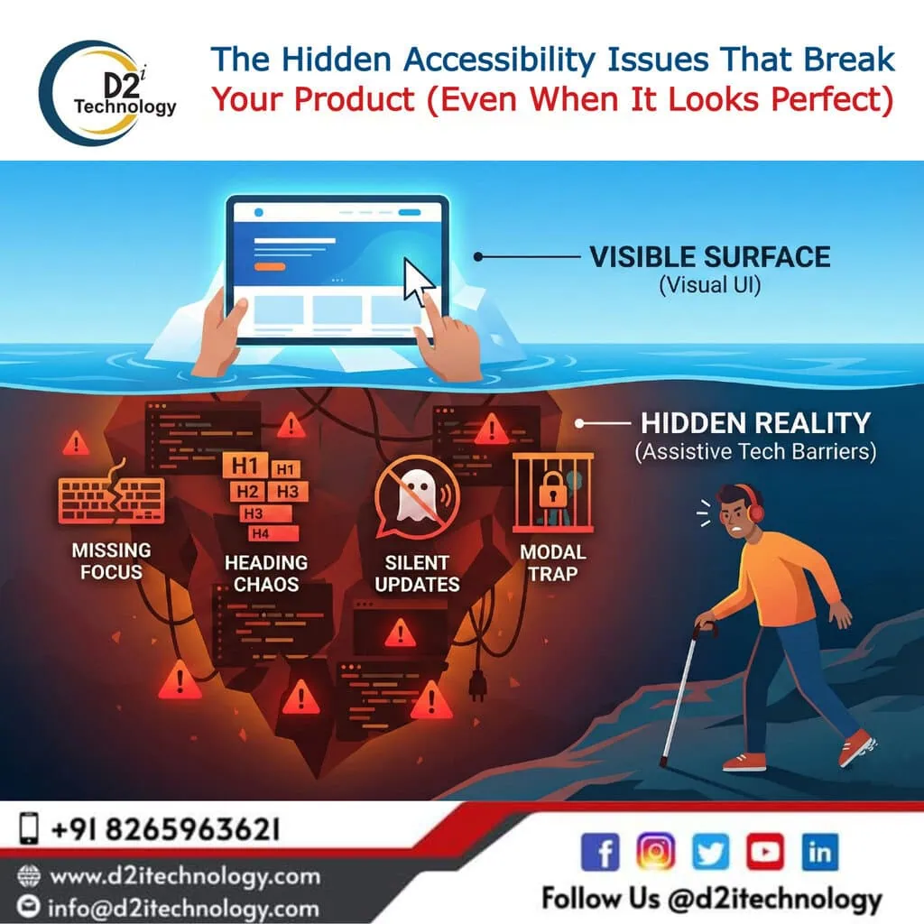
The Hidden Accessibility Issues That Break Your Product (Even When It Looks Perfect)
Your product looks great. The design is clean, the features work smoothly, and your QA team has signed off on every test case. So why are users still struggling?
Here’s the uncomfortable truth: some of the most damaging accessibility issues are completely invisible to standard testing. They don’t cause visual glitches. They don’t trigger error messages. They simply make your product unusable for a significant portion of your audience—people who rely on keyboards, screen readers, and other assistive technologies.
These hidden barriers often go undetected until a frustrated user reaches out, or worse, quietly leaves and never comes back. Let’s explore what these issues look like and why they matter more than you might think.
1. Focus Indicators: The Silent Navigation Killer
When you click a button, you see something happen. But what about users who navigate with a keyboard? They rely entirely on focus indicators—those visible outlines that show which element is currently active.
When focus indicators are missing, faint, or styled away for “aesthetic” reasons, keyboard users are essentially navigating blindfolded. They tab through the page with no idea where they are, often activating the wrong elements or getting completely lost.
Why this happens: Designers sometimes remove default browser focus styles because they look “ugly,” but forget to replace them with custom alternatives that meet contrast requirements.
The fix: Ensure every interactive element has a clearly visible focus state with sufficient contrast (at least 3:1 against adjacent colours). Test by unplugging your mouse and navigating your entire site using only the Tab and Enter keys.
2. Heading Levels: Structure That Screen Readers Depend On
Headings aren’t just visual hierarchy—they’re navigational landmarks for assistive technology users. Screen reader users often jump from heading to heading to understand page structure and find content quickly.
When heading levels skip around (jumping from H1 to H4, for instance) or are used purely for styling purposes, the logical reading flow breaks down. What seems like a minor HTML choice becomes a confusing maze for anyone using assistive technology.
Why this happens: Developers sometimes choose heading tags based on how they look rather than their semantic meaning. An H3 might “look right” for a section, even when an H2 would be structurally correct.
The fix: Use headings in proper sequential order (H1, then H2, then H3, and so on). If you need different visual styling, use CSS—not incorrect heading levels.
3. Unannounced Updates: When Important Information Goes Unheard
Imagine filling out a form, making a mistake, and having no idea an error message appeared. For screen reader users, this happens constantly when developers fail to implement proper ARIA live regions.
Dynamic content updates—error messages, success notifications, loading states, real-time alerts—need to be programmatically announced. Without proper markup, these updates are completely invisible to assistive technologies, leaving users confused about what’s happening on the page.
Why this happens: Visual users see the change immediately, so developers assume everyone does. The update “works” in standard testing, but the announcement mechanism was never built.
The fix: Use ARIA live regions (aria-live=”polite” or aria-live=”assertive”) to ensure dynamic content changes are announced to screen readers. Test with actual screen reader software, not just visual inspection.
4. Modal Focus Traps: Locking Users Out of Your Interface
Modals and dialog boxes require careful focus management. When a modal opens, focus should move to it. When it closes, focus should return to the triggering element. And while the modal is open, focus should stay contained within it.
Get any of these wrong, and you create a trap. Users might find themselves stuck inside a modal with no way to close it using a keyboard. Or they might close it and find their focus has jumped to some random part of the page—or disappeared entirely.
Why this happens: Modal libraries don’t always handle focus management out of the box, and custom implementations often overlook these requirements entirely.
The fix: When opening a modal, move focus to the first focusable element inside it. Trap focus within the modal using JavaScript. On close, return focus to the element that triggered it. Always provide a keyboard-accessible close mechanism (typically the Escape key).
Why Standard QA Misses These Issues
Traditional quality assurance focuses on what you can see. Does the button work? Does the form submit? Does the page load correctly? These tests rarely account for how the experience feels when you can’t use a mouse or can’t see the screen.
Accessibility issues don’t throw errors in the console. They don’t break layouts. They quietly exclude users in ways that only become apparent when you test with the right tools and methodologies.This is exactly why accessibility testing requires a different approach—one that combines automated scanning with expert manual evaluation.
How D2i Technology Approaches Accessibility Testing
At D2i Technology, our certified accessibility engineers don’t just run automated scans and call it a day. We validate accessibility at the code level, combining advanced automation with hands-on expert testing.
Our approach includes:
- Manual keyboard and screen reader testing to catch issues automation can’t detect
- WCAG 2.1 and 2.2 compliance validation against AA and AAA success criteria
- Code-level remediation guidance so your development team knows exactly what to fix
- Integration with your existing QA workflow to catch issues before they reach production
We believe accessibility isn’t a checkbox—it’s a commitment to building products that genuinely work for everyone.
Final Thoughts
The four issues we’ve covered—missing focus indicators, improper headings, unannounced updates, and broken modal focus—are just the beginning. Dozens of similar problems lurk beneath the surface of products that appear perfectly functional.
The good news? These issues are entirely preventable when you build accessibility into your development and testing process from the start.
Build experiences that everyone can use—not just those who can use a mouse.
Ready to uncover the hidden accessibility barriers in your product? Contact D2i Technology for a comprehensive accessibility audit.