- Accessibility Remediation
- April 8, 2026
Enhance Your Site: Color Contrast Tools for Accessibility
Color contrast might seem like a minor design detail, but it fundamentally determines whether millions of users can read your content. Using a reliable web accessibility color contrast tool ensures your website meets WCAG standards while creating better user experiences for everyone—from people with visual impairments to anyone viewing your site in bright sunlight or on older displays. Poor color contrast isn’t just an accessibility barrier; it’s a business problem that drives away customers, triggers lawsuits, and damages brand reputation. Understanding how to evaluate and optimize color contrast transforms this potential liability into a competitive advantage.
This comprehensive guide explores everything you need to know about color contrast in web accessibility: why it matters, how to test it, which tools work best, and how to implement contrast improvements that enhance both accessibility and visual design.
Why Color Contrast Matters for Web Accessibility
Color contrast directly impacts readability and comprehension for vast user populations.
The Visual Reality
Over 300 million people worldwide have color vision deficiencies. Millions more experience age-related vision decline, cataracts, or other conditions affecting contrast sensitivity. For these users, insufficient contrast makes content effectively invisible.
But contrast affects everyone:
- Low contrast strains eyes causing fatigue
- Bright environments wash out subtle color differences
- Poor contrast reduces reading speed and comprehension
- Aging reduces contrast sensitivity for all users
- Display quality varies dramatically across devices
Explore how color contrast goes beyond WCAG requirements for truly inclusive design.
Legal and Compliance Requirements
Accessibility regulations worldwide mandate specific contrast ratios:
WCAG 2.0 and 2.1 Standards:
- Level AA requires 4.5:1 for normal text
- Level AA requires 3:1 for large text (18pt+ or 14pt+ bold)
- Level AAA requires 7:1 for normal text
- Level AAA requires 4.5:1 for large text
Regulatory Impact:
- ADA compliance in the United States
- European Accessibility Act requirements
- SEBI mandates for Indian financial institutions
- Section 508 for U.S. government websites
- AODA standards in Canada
Non-compliance carries real consequences: lawsuits, fines, exclusion from contracts, and reputational damage. Understanding common accessibility issues helps prevent compliance problems.
Business Benefits
Proper color contrast delivers measurable advantages:
- Increased readability improves conversion rates
- Better user experience reduces bounce rates
- Wider audience reach expands market potential
- Enhanced SEO through accessibility signals
- Reduced legal and compliance risks
- Professional appearance builds trust
Learn how accessibility importance affects SEO and search rankings.
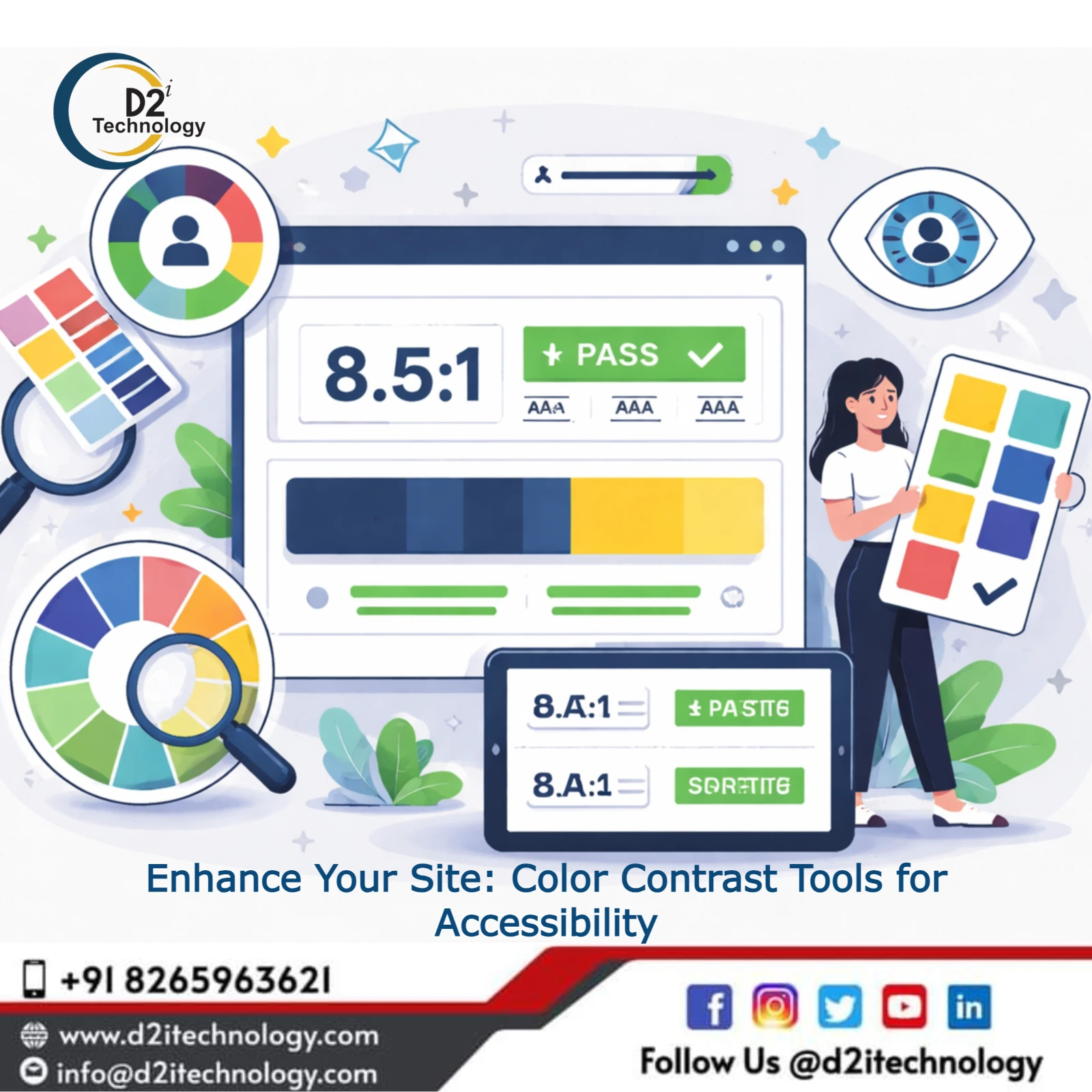
Understanding WCAG Contrast Ratios
Color contrast is measured as a ratio comparing luminance between foreground and background colors.
How Contrast Ratios Work
Contrast ratios range from 1:1 (no contrast, same color) to 21:1 (maximum contrast, black on white or white on black).
Calculation Formula: Contrast ratio = (L1 + 0.05) / (L2 + 0.05)
Where L1 is the relative luminance of the lighter color and L2 is the relative luminance of the darker color.
WCAG Requirements:
- 4.5:1 – Level AA for normal text (under 18pt or under 14pt bold)
- 3:1 – Level AA for large text (18pt+ or 14pt+ bold)
- 7:1 – Level AAA for normal text
- 4.5:1 – Level AAA for large text
- 3:1 – UI components and graphical objects
Common Contrast Mistakes
Designers frequently make these errors:
Gray Text on White Backgrounds: Light gray (#999999) on white fails WCAG AA. Even medium gray (#767676) barely passes at 4.54:1.
Colored Text Issues: Light blue links, yellow warnings, and pastel colors often fail contrast requirements. Popular brand colors frequently need adjustment for accessibility.
Image Overlays: Text on photos or gradients creates variable contrast. Background overlays or solid color boxes solve this problem.
Placeholder Text: Browser default placeholder text (often light gray) frequently fails contrast standards. Custom styling ensures readability.
Insufficient Button Contrast: Both button text and button borders need adequate contrast against backgrounds.
Best Web Accessibility Color Contrast Tools
Multiple color contrast checker online options help evaluate and improve color combinations.
WebAIM Contrast Checker
Features:
- Simple interface with color picker
- Instant WCAG compliance results
- Simulated vision deficiency preview
- Lightness adjustment suggestions
- Free and no registration required
Best For: Quick checks during design and development. The straightforward interface makes it ideal for beginners.
Colorable
Features:
- Interactive color adjustment
- Real-time contrast ratio updates
- Multiple color format support (hex, RGB, HSL)
- Clean, minimal interface
- Accessible color palette suggestions
Best For: Designers exploring color variations while maintaining compliance.
Contrast Ratio by Lea Verou
Features:
- Visual representation of ratio
- Live adjustment with immediate feedback
- Multiple color input methods
- Mathematical precision
- Open-source and transparent
Best For: Technical users wanting detailed contrast calculations.
Who Can Use
Features:
- Comprehensive color combinations
- Vision simulation filters
- API for automated checking
- Color blind safe palette suggestions
- Export and sharing capabilities
Best For: Teams collaborating on accessible color schemes.
Color Oracle
Features:
- Desktop application for Windows, Mac, Linux
- Full-screen color blindness simulation
- Real-time screen transformation
- Multiple deficiency types
- Works with any application
Best For: Testing actual interfaces rather than isolated color combinations.
Accessible Colors
Features:
- Automatic color adjustment
- Suggests compliant alternatives
- Preserves original hue
- Algorithm-driven optimization
- Multiple WCAG level targeting
Best For: Finding accessible alternatives to brand colors.
Browser Developer Tools
Modern browsers include built-in accessibility checkers:
Chrome DevTools:
- Lighthouse accessibility audit
- Color contrast issue highlighting
- Suggested improvements
- Integrated workflow
Firefox Accessibility Inspector:
- Contrast ratio display
- Color deficiency simulation
- Issue identification
- DOM tree integration
Learn about the best accessibility testing toolkit for comprehensive evaluation.
Using Color Contrast Tools Effectively
Maximize tool effectiveness through systematic evaluation.
Step-by-Step Testing Process
1. Identify Color Combinations: List all text colors, background colors, button colors, link colors, and UI component colors used throughout your site.
2. Test Each Combination: Use a WCAG contrast checker to evaluate every text/background pair. Don’t assume similar colors have similar results—slight variations significantly impact ratios.
3. Document Results: Record which combinations pass, fail, or marginally pass (close to minimum). This documentation guides remediation priorities.
4. Prioritize Fixes: Address critical issues first:
- Body text contrast (highest impact)
- Navigation and links
- Calls-to-action and buttons
- Form fields and labels
- Error messages and alerts
5. Adjust Colors: Modify colors until achieving target contrast ratios. Tools with real-time adjustment streamline this process.
6. Verify in Context: Test adjusted colors in actual designs, not just abstract color squares. Context affects perceived contrast.
7. Simulate Vision Deficiencies: Check designs through color blindness filters ensuring accessibility for various visual conditions.
Testing Different Content Types
Body Text: Primary content requires 4.5:1 minimum. Test multiple paragraph styles, including font weights and sizes.
Headings: Larger headings may qualify for 3:1 ratio if meeting size requirements (18pt+ or 14pt+ bold).
Links: Link text needs 4.5:1 against background. If relying on color alone for link identification, links must have 3:1 contrast against surrounding text.
Buttons: Button text and button borders both require adequate contrast. Test normal, hover, focus, and disabled states.
Forms: Labels, input fields, placeholder text, and error messages all need evaluation. Form elements present multiple contrast relationships.
Icons and Graphics: Graphical objects conveying information require 3:1 contrast against adjacent colors.
Understand keyboard navigation accessibility for complete usability.
Implementing Contrast Improvements
Finding problems is half the battle—fixing them effectively completes the job.
Color Adjustment Strategies
Darkening Light Colors: Adjust lighter foreground colors darker until achieving required ratio. Maintains general aesthetic while improving accessibility.
Lightening Dark Backgrounds: For dark modes or dark sections, lighten backgrounds rather than darkening text excessively.
Adding Background Overlays: Text on images benefits from semi-transparent overlays (black for light text, white for dark text) ensuring consistent contrast.
Using Color Variables: Define colors in CSS custom properties or preprocessor variables enabling site-wide updates:
:root {
–text-primary: #212121; /* 16.1:1 on white */
–text-secondary: #555555; /* 7.5:1 on white */
–link-color: #0066CC; /* 8.2:1 on white */
}
Implementing Dark Mode: Design separate color palettes for light and dark modes, testing each independently for contrast compliance.
Design System Integration
Build accessibility into your design foundation:
Color Palette Creation: Develop accessible color palettes from the start. Define primary, secondary, and accent colors meeting contrast requirements.
Component Libraries: Ensure all reusable components—buttons, cards, badges, alerts—use accessible color combinations by default.
Design Tokens: Semantic color tokens (e.g., text-primary, bg-surface, border-default) enforce consistency and simplify maintenance.
Documentation: Document approved color combinations with their contrast ratios. Prevent designers from using non-compliant combinations.
Automated Checks: Integrate contrast checking into design tools (Figma plugins, Sketch plugins) catching issues during design phase.
Learn about the web accessibility guide for developers for implementation best practices.
Advanced Contrast Considerations
Beyond basic compliance, consider these nuanced scenarios.
Transparency and Opacity
Semi-transparent colors complicate contrast calculations:
- Actual rendered color depends on underlying background
- Test final computed colors after transparency application
- Avoid relying on transparency for critical text
- Consider all possible background variations
Gradients and Images
Variable backgrounds create contrast challenges:
- Test contrast at all gradient points
- Use solid backgrounds for critical text
- Implement text shadows or outlines for photography
- Consider multiple overlay strategies
Animation and State Changes
Interactive elements require consistent contrast:
- Test hover states, focus indicators, and active states
- Ensure focus indicators meet 3:1 contrast
- Verify disabled state contrast remains sufficient
- Check loading and transition states
Brand Color Conflicts
Brand guidelines sometimes conflict with accessibility:
Resolution Strategies:
- Use brand colors for non-text elements (borders, backgrounds, icons)
- Adjust brand colors slightly for text usage
- Reserve original brand colors for large elements
- Document accessibility-approved brand color variations
Small Text Considerations
Text under 18pt (or 14pt bold) requires higher contrast. Be especially careful with:
- Fine print and disclaimers
- Copyright notices
- Form helper text
- Table data
- Metadata and timestamps
Testing at Scale
Evaluating contrast across large sites requires systematic approaches.
Automated Scanning
Use comprehensive scanning tools:
- axe DevTools
- Lighthouse CI
- Pa11y
- Wave API
- Accessibility Insights
Automated tools identify contrast violations across entire sites, though they can’t test dynamic content or detect all contextual issues.
Explore various accessibility testing tools available for different needs.
CI/CD Integration
Prevent regression through automated checking:
- Add accessibility tests to continuous integration
- Fail builds on critical contrast violations
- Generate accessibility reports automatically
- Track improvements over time
Manual Spot Checking
Combine automation with strategic manual testing:
- Sample representative page types
- Test dynamic content and user interactions
- Verify fixes in multiple browsers
- Check responsive breakpoints
- Validate dark mode implementations
Third-Party Content
Don’t forget embedded content:
- Third-party widgets and plugins
- User-generated content
- Advertising
- Social media embeds
- Chat interfaces
Provide guidelines ensuring third-party content meets accessibility standards.
Color Contrast Best Practices
Follow these principles for accessible, attractive designs.
Design-First Approach
Consider contrast from initial design:
- Start with accessible base colors
- Test combinations before extensive implementation
- Use sufficient contrast as creative constraint
- Explore high-contrast aesthetics
Avoid Color-Only Communication
Never rely solely on color to convey information:
- Use icons alongside color coding
- Provide text labels
- Add patterns or textures
- Implement multiple visual cues
Test With Real Users
Nothing replaces actual user feedback:
- Include users with visual impairments in testing
- Gather feedback on readability and fatigue
- Test in various lighting conditions
- Observe real-world usage patterns
Document Everything
Maintain comprehensive documentation:
- Approved color combinations with ratios
- Brand color accessibility guidelines
- Exception handling procedures
- Testing methodology and tools
- Remediation processes
Understand how hidden accessibility issues can break products even when they look perfect.
Common Questions About Color Contrast
Can I Use Light Gray Text?
Light gray (#999999, RGB 153,153,153) on white backgrounds fails WCAG AA with only 2.8:1 contrast. Use #767676 (4.54:1) or darker for compliant body text. Reserve lighter grays for large text or decorative elements.
Do Icons Need Contrast Requirements?
Yes, meaningful icons and graphical elements require 3:1 contrast against adjacent colors. Decorative icons without conveyed meaning are exempt.
How Does Dark Mode Affect Contrast?
Dark mode requires separate contrast evaluation. White text on black backgrounds provides maximum 21:1 contrast, but most dark modes use slightly lighter backgrounds (#121212, #1E1E1E) for reduced eye strain, affecting calculations.
What About Gradient Backgrounds?
Test contrast at both the lightest and darkest gradient points. If text spans the gradient, ensure adequate contrast across the entire range or use solid backgrounds for text regions.
The D2i Technology Approach to Accessible Design
As specialists in web accessibility, D2i Technology integrates contrast optimization throughout our development process.
Comprehensive Accessibility Testing
Our services include:
- Complete WCAG compliance auditing
- Color contrast evaluation across platforms
- Assistive technology testing
- User testing with disabled individuals
- Detailed remediation guidance
Explore our accessibility testing services for comprehensive evaluation.
Design System Development
We build accessible foundations:
- Color palettes meeting WCAG standards
- Component libraries with built-in accessibility
- Design tokens ensuring consistency
- Documentation and implementation guides
Training and Consultation
Building internal capabilities:
- Designer training on accessible color selection
- Developer education on implementation
- Stakeholder awareness building
- Ongoing consultation and support
Learn about proactive accessibility and its importance.
Tools Integration Workflow
Integrate contrast checking into existing workflows seamlessly.
Design Phase
- Figma plugins for real-time checking
- Sketch accessibility validators
- Adobe XD contrast checkers
- Design system documentation
Development Phase
- Browser DevTools for immediate feedback
- Code editor extensions
- Automated testing in build process
- Pre-commit hooks for validation
Testing Phase
- Manual color contrast checker online verification
- Automated scanning across environments
- Assistive technology validation
- User testing confirmation
Maintenance Phase
- Regular automated scanning
- Periodic manual audits
- New feature pre-launch checks
- Continuous monitoring
Conclusion
Color contrast fundamentally determines whether your digital experiences welcome all users or create barriers. Using reliable web accessibility color contrast tools and WCAG contrast checkers ensures compliance while improving usability for everyone. From initial design through ongoing maintenance, systematic contrast evaluation and optimization delivers better experiences, reduced legal risks, and expanded market reach.
The right approach combines automated tools for efficiency, manual evaluation for context, and user testing for real-world validation. Start with comprehensive audits identifying current issues, prioritize high-impact fixes, and integrate contrast checking into design and development workflows preventing future problems.
Don’t let poor contrast limit your audience or expose you to compliance risks. Take control of color accessibility today.
Frequently Asked Questions
Make Your Website Accessible to Everyone
Ready to ensure your website meets WCAG color contrast standards and provides excellent experiences for all users? D2i Technology's accessibility experts deliver comprehensive testing, detailed remediation guidance, and ongoing support ensuring your digital platforms welcome everyone.